
How to Create Hamburger Mobile Menu with Elementor Template?
Looking to make your website’s navigation user-friendly on mobile devices? A cluttered menu can frustrate visitors and drive them away.
A full-screen off-canvas variant of this same mobile pattern is covered in how to create an off-canvas mobile menu.
How to Create Hamburger Mobile Menu with Elementor Template starts with picking the right pre-built template.
This guide covers how to create a hamburger mobile menu with an Elementor template, start to finish.
When users can’t easily find what they need, your site’s engagement and conversions suffer.
But you don’t have to settle for a poor mobile experience. Discover how to create a sleek hamburger mobile menu using Elementor templates and give your visitors easy navigation.
Let’s get started!
Step-by-Step Guide to Creating a Hamburger Mobile Menu with Elementor
1. Prepare Your Tools
To get started, make sure you have the following:
- The Plus Addons for Elementor installed and activated.
- Either the free Nexter Builder or Elementor Pro to create header templates.
2. Create Your Mobile Menu Template
- In your WordPress dashboard, navigate to Templates and create a new Elementor template specifically designed for your mobile menu.
- Design this template as you wish, keeping mobile usability in mind.
3. Add the Navigation Menu Widget
- Open your header template in Elementor.
- Drag and drop the Navigation Menu widget from The Plus Addons onto your header.
4. Configure the Mobile Menu
- In the widget settings, go to the Navigation Bar tab and set up your desktop menu first.
- Next, switch to the Mobile Menu tab.
- Enable the Responsive Mobile Menu toggle to activate mobile-specific settings.
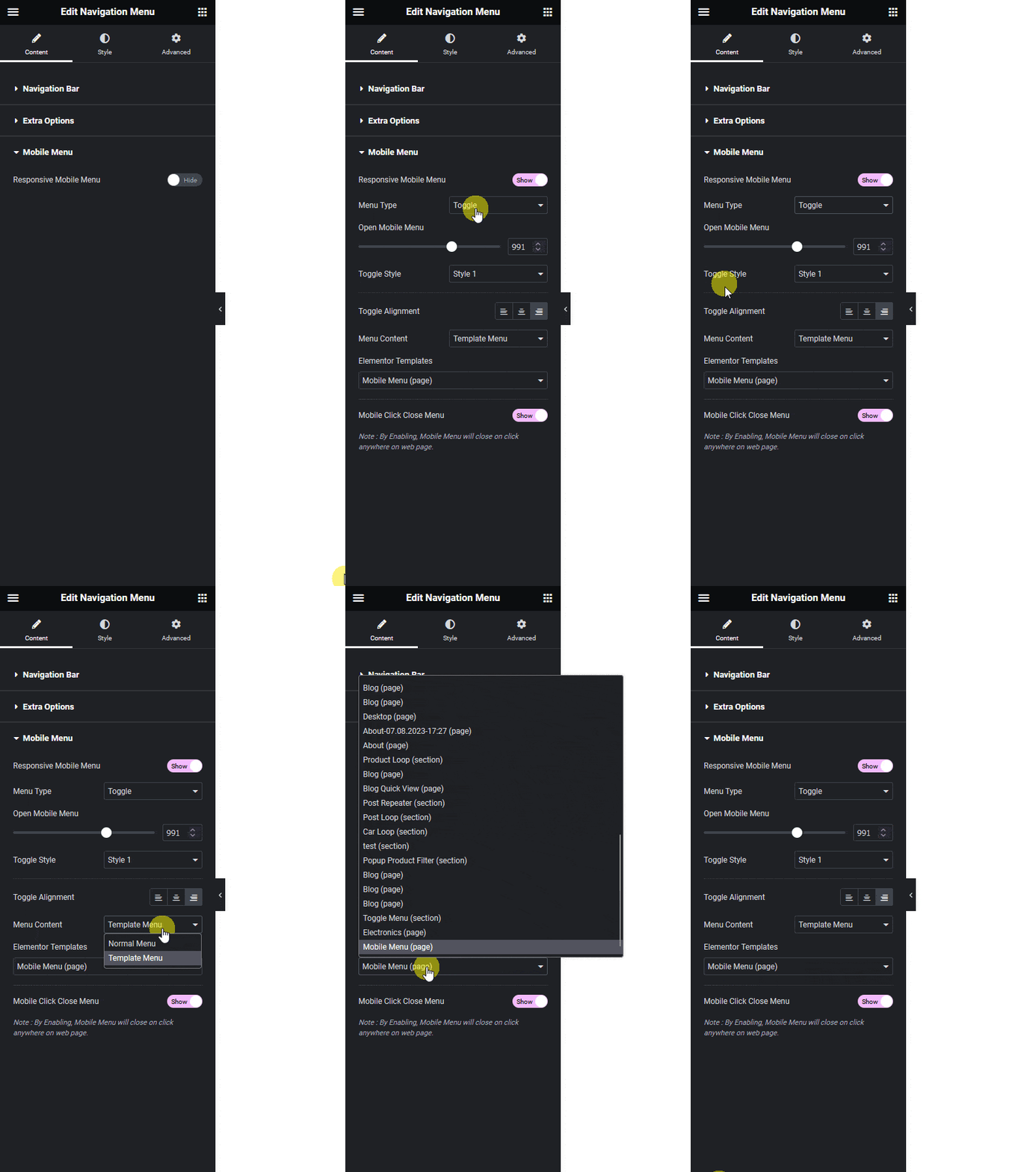
5. Select the Hamburger Menu Type
- In the Menu Type dropdown, choose an option suitable for mobile (anything except Off Canvas for this setup).
- This will enable the hamburger menu style for mobile devices.
6. Set Your Menu Content
- Under Menu Content, select Template Menu.
- In the Elementor Templates dropdown, pick the mobile menu template you created earlier.
7. Preview and Fine-Tune
- Save your changes and preview your site on a mobile device.
- Make any necessary adjustments to ensure your hamburger menu looks and works perfectly.
Wrapping Up
Creating a custom hamburger mobile menu with Elementor and The Plus Addons is a straightforward process that can dramatically improve your website’s mobile navigation.
By following these steps, you ensure your visitors enjoy a smooth, intuitive browsing experience, no matter what device they’re using.
Want the sticky header without the code?
Sticky Header Effects for Elementor drops in as a widget. Free plugin, no account needed.
