Looking to make your website’s navigation user-friendly on mobile devices? A cluttered menu can frustrate visitors and drive them away.
When users can’t easily find what they need, your site’s engagement and conversions suffer.
But you don’t have to settle for a poor mobile experience. Discover how to create a sleek hamburger mobile menu using Elementor templates and give your visitors seamless navigation.
Let’s get started!
Step-by-Step Guide to Creating a Hamburger Mobile Menu with Elementor
1. Prepare Your Tools
To get started, make sure you have the following:
- The Plus Addons for Elementor installed and activated.
- Either the free Nexter Builder or Elementor Pro to create header templates.
2. Create Your Mobile Menu Template
- In your WordPress dashboard, navigate to Templates and create a new Elementor template specifically designed for your mobile menu.
- Design this template as you wish, keeping mobile usability in mind.
3. Add the Navigation Menu Widget
- Open your header template in Elementor.
- Drag and drop the Navigation Menu widget from The Plus Addons onto your header.
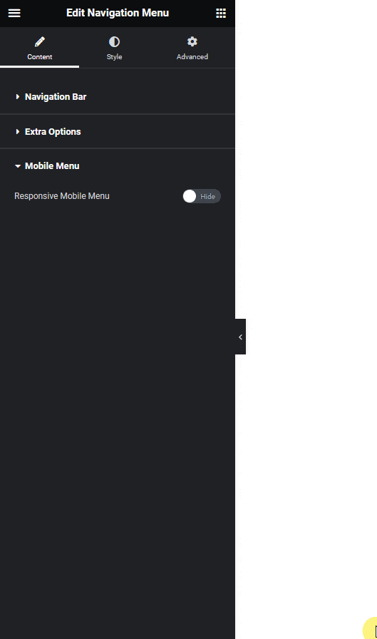
4. Configure the Mobile Menu
- In the widget settings, go to the Navigation Bar tab and set up your desktop menu first.
- Next, switch to the Mobile Menu tab.
- Enable the Responsive Mobile Menu toggle to activate mobile-specific settings.
5. Select the Hamburger Menu Type
- In the Menu Type dropdown, choose an option suitable for mobile (anything except Off Canvas for this setup).
- This will enable the hamburger menu style for mobile devices.
6. Set Your Menu Content
- Under Menu Content, select Template Menu.
- In the Elementor Templates dropdown, pick the mobile menu template you created earlier.
7. Preview and Fine-Tune
- Save your changes and preview your site on a mobile device.
- Make any necessary adjustments to ensure your hamburger menu looks and works perfectly.
Wrapping Up
Creating a custom hamburger mobile menu with Elementor and The Plus Addons is a straightforward process that can dramatically improve your website’s mobile navigation.
By following these steps, you ensure your visitors enjoy a smooth, intuitive browsing experience, no matter what device they’re using.