
Designing a Header That Doesn’t Shift Your Layout: A Core Web Vitals Primer
A header is one of the most common sources of layout shift on a WordPress page, because it loads early, sits above everything else, and is exactly where a font swap, an unset image dimension, or a scroll-triggered resize does the most visible damage. This is a primer on why that happens and how to design a header that does not do it.
A core web vitals layout shift problem caused by a header is avoidable almost entirely by choosing transform-based scroll effects over height-based ones.
Key Takeaways
- Cumulative Layout Shift, one of Google’s three Core Web Vitals, measures how much visible content moves unexpectedly while a page loads or is interacted with.
- A header causes layout shift most often through unset image dimensions, a web font swap that changes text width, or a JavaScript-driven resize on scroll that recalculates height.
- Effects that animate with CSS transform and opacity do not trigger the same layout recalculation that animating height, width, or padding directly does.
- Sticky Header Effects for Elementor states its own effects run on transform and opacity only, a claim confirmed live on its homepage; that specific technical choice is why a sticky header can add scroll behavior without necessarily adding layout shift.
- Testing this needs a real tool, not a visual guess. PageSpeed Insights and Chrome DevTools’ own Performance panel both report a numeric Cumulative Layout Shift score.
What Cumulative Layout Shift Actually Measures
Cumulative Layout Shift, or CLS, is one of Google’s three Core Web Vitals, alongside Largest Contentful Paint and Interaction to Next Paint. It scores how much visible page content moves without warning, whether during initial load or later, while the page is being used.
A score is calculated from how much of the viewport shifts and how far it moves, per web.dev’s own Cumulative Layout Shift documentation, the primary source for the metric’s exact calculation. A lower score is better; Google’s published thresholds treat 0.1 or under as good.
Why Headers Are a Common Source of Shift
A header sits at the very top of the page, loads early, and is usually the first thing a visitor looks at. Three specific header patterns account for most of the layout shift a header introduces.
An image without set dimensions. A logo image with no width and height attributes (or equivalent CSS aspect-ratio) forces the browser to guess its size, then correct once the image finishes loading, pushing everything below it down or up by the difference.
A web font swap. If the menu text renders first in a fallback font, then swaps to a custom web font with different letter widths once it loads, the menu can visibly reflow, sometimes wrapping to a second line and pushing content down.
A scroll-triggered resize that animates height or padding directly. A header-shrink effect built by animating a height or padding value forces the browser to recalculate the layout of everything below it on every scroll frame, which is a real performance cost, distinct from CLS but related to it if the recalculation is visible as a jump rather than a smooth transition.

Designing the Header to Avoid It
Set explicit width and height on the logo image, or use Elementor’s own image sizing controls rather than leaving dimensions unset. This alone removes one of the three most common causes of header-driven shift, on any WordPress site, with or without a sticky-header plugin involved.
For scroll-triggered effects specifically, prefer ones built on CSS transform and opacity rather than height, width, top, or padding. A transform-based shrink effect scales visually without forcing the browser to reflow the elements around it, which is the mechanical reason it avoids the layout-recalculation cost a height-based version has.
This is stated directly as a design choice on Sticky Header Effects for Elementor’s own homepage, confirmed live: every one of its 21 effects, including Header Shrinking and Logo Shrinking, runs on transform and opacity only, which the page states is why scrolling holds 60 frames per second and Core Web Vitals are not affected by turning an effect on.
Per-Device Testing Matters More Than It Looks
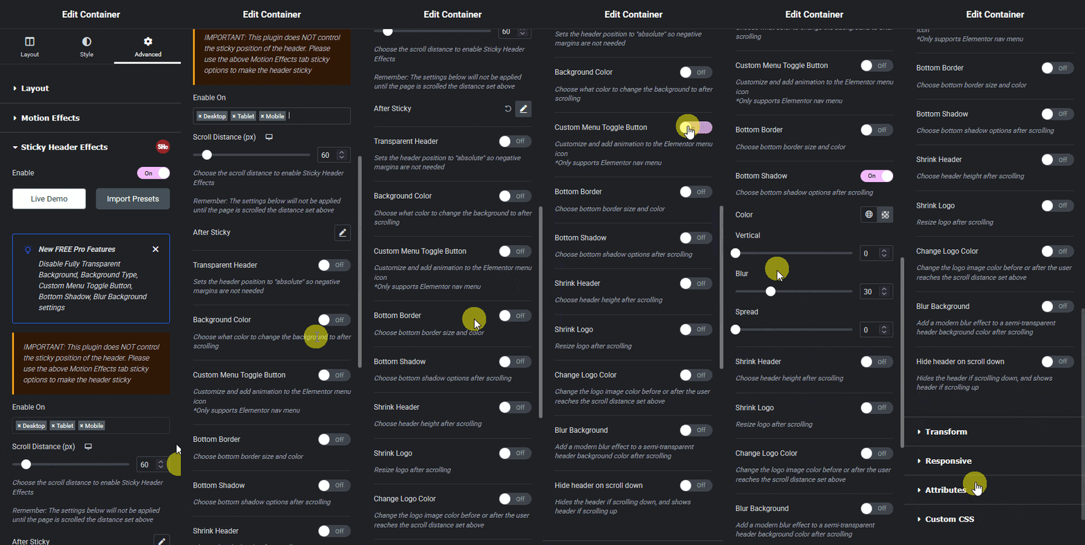
A header that scores well on desktop can still shift on mobile, where a smaller viewport makes any unset dimension or font-swap effect proportionally more visible. Test Core Web Vitals for mobile and desktop separately rather than assuming a single desktop test represents the whole audience.
Any effect that can be configured per device, shrink amount, logo size, scroll distance, should be checked at each breakpoint specifically, since a value copied across devices without adjustment is one of the more common ways a header ends up shifting on one screen size but not another.
How to Actually Measure It
Google’s own Core Web Vitals overview explains all three metrics and how they are measured, both in the field (real visitor data) and in the lab (a single simulated test). PageSpeed Insights reports both for any public URL, including a numeric CLS score and which page elements contributed to it.
Chrome DevTools’ own Performance panel can record a live session and flag individual layout-shift events with the exact element responsible, which is more useful for diagnosing a specific header than a single aggregate score. Run it while scrolling through any scroll-triggered header effect specifically, not just on initial page load.
What This Does Not Guarantee
Using transform and opacity for scroll effects removes one specific, common cause of shift. It does not guarantee a perfect CLS score on its own; an unoptimized logo image, a slow-loading web font, or an unrelated ad or cookie banner elsewhere on the page can still cause shift regardless of how the header’s own scroll effects are built.
Core Web Vitals are a page-level measurement, not a plugin-level one. A well-built header is one input among several; the rest of the page still has to be measured and fixed on its own terms.
Frequently Asked Questions
Does a sticky header always hurt Core Web Vitals? No. The sticky positioning itself is not the risk; how the scroll effects on top of it are animated is. Transform- and opacity-based effects avoid the layout-recalculation cost that height- or width-based animations carry.
Is 0.1 a good Cumulative Layout Shift score? Per Google’s published thresholds, 0.1 or under is the “good” range, 0.1 to 0.25 needs improvement, and above 0.25 is poor.
Where do I check my own header’s CLS score? PageSpeed Insights, run against your live published URL, is the most direct free option, and reports which specific element contributed to any shift detected.
Does per-device configuration affect Core Web Vitals scoring? Indirectly. Google measures field data separately by device type, so a header tuned only for desktop can carry a worse mobile score even if the desktop number looks acceptable.
For the full effect set built on this transform-and-opacity approach, see the Elementor sticky header setup guide and the plugin’s own documentation. For the underlying CSS mechanics, MDN’s position reference and transform reference are the primary sources.
Want the sticky header without the code?
Sticky Header Effects for Elementor drops in as a widget. Free plugin, no account needed.
