Want to create a smooth, user-friendly swiper menu for your mobile site in Elementor? Many website owners find this challenging to design navigation that’s both stylish and functional on small screens.
But don’t worry! With Elementor’s powerful tools and a few simple steps, you can easily build an interactive swiper menu that delights your visitors.
In this blog, you’ll discover how to craft a seamless swiper menu for mobile, boosting both usability and engagement.
Step-by-Step Guide to Creating a Swiper Menu in Elementor
1. Install The Plus Addons for Elementor
First things first, make sure you have The Plus Addons for Elementor installed and activated on your website.
This toolkit unlocks advanced features, including the Navigation Menu widget you’ll need for your swiper menu.
Tip: If you haven’t already created a header template, you can use the free Nexter Builder or Elementor Pro.
2. Add the Navigation Menu Widget
- Open your header template in Elementor.
- Drag and drop the Navigation Menu widget from The Plus Addons onto your header section.
3. Configure the Navigation Bar
- In the Navigation Bar tab, choose your preferred Menu Type and Menu Direction.
- Select the WordPress menu you want to display.
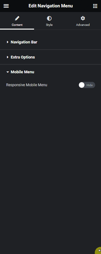
4. Enable the Responsive Mobile Menu
- Go to the Mobile Menu tab.
- Toggle on the Responsive Mobile Menu option to activate mobile-specific settings.
5. Set Menu Type to Swiper
- In the Menu Type dropdown, select Swiper.
- This enables swipe gestures, allowing users to navigate menu items by swiping left or right.
6. Adjust Mobile Menu Settings
- Under Open Mobile Menu, set the minimum width for when the mobile menu should activate.
- Use the Navigation Alignment settings to position your menu items as you like.
7. Choose Your Menu Content
- In the Menu Content dropdown, pick between:
- Normal Menu (uses your WordPress default menu)
- Template Menu (uses an Elementor template)
- Normal Menu (uses your WordPress default menu)
- For most users, Normal Menu is the simplest option.
8. Select Your Menu
- In the Select Menu dropdown, choose the menu you want to display as a swiper menu on mobile.
9. Preview and Publish
- Preview your mobile menu to ensure the swiper functionality works smoothly.
- Once satisfied, publish your changes.

Wrapping Up
Creating a swiper menu for mobile in Elementor is easier than ever with The Plus Addons.
By following these straightforward steps, you’ll deliver a modern, touch-friendly navigation experience that keeps your mobile visitors engaged and happy.
Don’t forget to experiment with different menu styles and settings to match your brand’s vibe.