Struggling to make your mobile site user-friendly because your menu is hard to navigate? When visitors can’t easily find what they need, they leave frustrated, costing you valuable engagement and conversions.
But you don’t have to settle for clunky navigation. In this blog, you’ll discover how to create a sleek, responsive toggle menu in Elementor so your users enjoy seamless browsing and you boost your site’s performance on every device.
1. Add the Navigation Menu Widget
First, ensure you have The Plus Addons for Elementor installed and activated. This powerful toolkit includes the Navigation Menu widget, which makes creating a mobile toggle menu a breeze.
- Open your header template in Elementor.
Tip: You can use the free Nexter Builder or Elementor Pro to create your header template.
- Drag and drop the Navigation Menu widget into your header section.
2. Configure Basic Menu Settings
- Go to the Navigation Bar tab.
- Choose your preferred Menu Type, Menu Direction, and select the menu you want to display.
3. Enable the Mobile Toggle Menu
- Switch to the Mobile Menu tab.
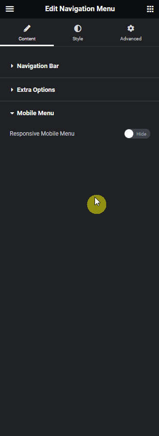
- Toggle on the Responsive Mobile Menu option.
- In the Menu Type dropdown, select Toggle to activate the mobile-friendly menu button.
4. Customize the Toggle Button
- In the Open Mobile Menu section, set the minimum width at which the mobile menu should appear.
- Choose your preferred toggle style from the Toggle Style dropdown. You can select a built-in style or upload a custom icon/image.
- Use the Toggle Alignment option to position the toggle button as you like.
5. Adjust Mobile Menu Alignment
- Use the Navigation Alignment setting to align the menu items within the mobile menu for the best user experience.
6. Select Menu Content Type
- From the Menu Content dropdown, decide how you want to display your menu:
- Normal Menu: Uses your WordPress default menu.
- Template Menu: Lets you use an Elementor template as your mobile menu.
- Normal Menu: Uses your WordPress default menu.
- For most cases, select Normal Menu.
7. Choose Your Menu
- In the Select Menu dropdown, pick the menu you want to display on mobile devices.
- You’ll now see a toggle button that opens your mobile menu, providing users with easy navigation.
Wrapping Up
Creating a toggle menu for mobile in Elementor is simple and highly effective with The Plus Addons.
By following these steps, you ensure your website is not only visually appealing but also user-friendly on any device.
A responsive toggle menu keeps your navigation organized, enhances user experience, and helps retain visitors.