Struggling to make your website’s mobile menu user-friendly? A cluttered or confusing navigation can frustrate visitors and drive them away.
But you don’t need expert coding skills to fix this!
With Elementor, you can create a sleek, professional hamburger toggle menu for mobile-completely free.
In this blog, you’ll learn step-by-step how to design and implement a responsive menu that keeps your site looking sharp and your users happy.
Let’s get started!
Prerequisites
Before you begin, make sure you have:
- Elementor installed on your WordPress site.
- The Plus Addons for Elementor plugin installed and activated.
- A navigation menu created in WordPress (via Appearance > Menus).
How to Create an Elementor Hamburger Toggle Menu for Mobile for Free [Step-by-Step]
A mobile-friendly website needs a simple, intuitive navigation menu. The hamburger toggle menu is a popular solution, letting users access your site’s pages without cluttering the screen.
Here’s how you can set up a hamburger menu for free using Elementor and The Plus Addons for Elementor.
Step 1: Add the Navigation Menu Lite Widget
- Open your header template: Use the free Nexter Builder plugin or Elementor Pro to create or edit your site’s header template.
- Insert the Navigation Menu Lite widget: Drag and drop the widget from The Plus Addons into your header section.
Step 2: Configure the Navigation Bar
- Select your menu: In the widget’s settings, go to the Navigation Bar tab. Choose the menu you created from the dropdown.
- Set menu direction: Pick the menu direction (horizontal or vertical) that best fits your design.
Step 3: Enable the Mobile Hamburger Menu
- Activate the responsive mobile menu: Switch to the Mobile Menu tab and toggle on the Responsive Mobile Menu option.
Step 3: Enable the Mobile Hamburger Menu
- Activate the responsive mobile menu: Switch to the Mobile Menu tab and toggle on the Responsive Mobile Menu option.
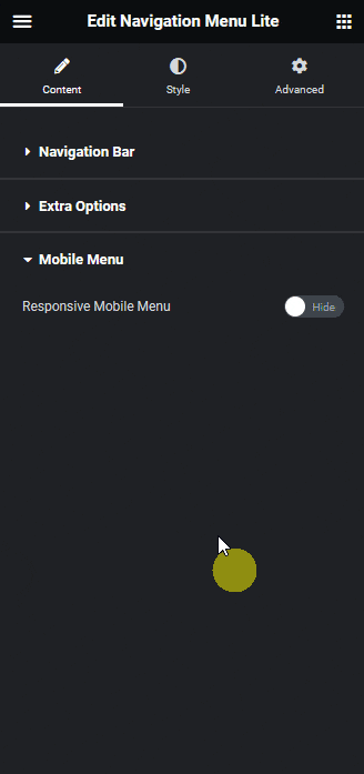
- Set minimum width: In the Open Mobile Menu section, specify the minimum screen width where the hamburger menu should appear (e.g., 1024px for tablets and mobiles).
- Choose toggle style: Under Toggle Style, pick the hamburger icon style you like.
- Align the toggle button: Use Toggle Alignment to position the hamburger icon (left, center, or right).
- Align mobile menu items: In Mobile Navigation Alignment, set how menu items should align when the menu is open.
Step 4: Finalize Menu Content
- Select menu content type: In the Menu Content dropdown, choose Normal Menu.
Assign your menu: Use the Select Menu dropdown to pick your WordPress menu.
Step 5: Preview and Save
Now, when you preview your site on mobile, you’ll see a sleek hamburger toggle button. Tapping it reveals your navigation menu, making it easy for users to explore your site.

Wrapping Up
Creating a mobile-friendly hamburger toggle menu with Elementor and The Plus Addons is easier than you think-and completely free!
By following these steps, you ensure your visitors enjoy smooth, intuitive navigation on any device. A clean, responsive menu not only improves user experience but also boosts your site’s professionalism.
Want even more customization? Explore other settings in The Plus Addons’ Navigation Menu Lite widget to tweak colors, animations, and layout for a unique look.