
Elementor Mega Menu: The Complete Setup Guide
A mega menu replaces a single-column dropdown with a wide panel of columns, images, and grouped links, and it is one of the most requested header upgrades among Elementor site owners. Elementor’s own Nav Menu widget handles a standard dropdown well, but a true multi-column mega menu is a different structure, and knowing exactly where Elementor’s native tools stop saves hours of trial and error.
Once the mega menu itself is built, making that header sticky and adding scroll effects is a separate step, covered in what a dedicated effects plugin adds.
Building an elementor mega menu from scratch takes longer than importing a template, but it gives full control over every column and breakpoint.
This guide covers what a mega menu actually needs, what Elementor Pro’s Nav Menu widget supports on its own, when a dedicated widget becomes necessary, and how to make the finished header behave well once it is built, including keeping it sticky and readable on scroll.
Key Takeaways
- Elementor Pro’s Nav Menu widget supports dropdown submenus natively. A true multi-column mega menu with images or grouped categories needs a dedicated mega-menu widget, not a setting inside the base widget.
- Mega menus and sticky headers are two separate jobs. Building the menu structure comes first, and making that header sticky with scroll effects is a separate step, unrelated to how the menu itself is built.
- Full-width mega menu panels need explicit width and position rules, since a dropdown that stays boxed in the parent link’s width will not display columns correctly.
- Mobile mega menus almost always need a simplified accordion layout instead of the desktop grid, since a wide multi-column panel does not fit a phone screen.
- Elementor Free has no native sticky header setting at all, and even Elementor Pro’s version is a plain on/off toggle with no scroll effects, a separate consideration from mega menu structure.
What a Mega Menu Actually Needs From Elementor
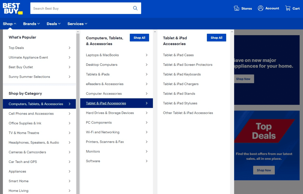
A mega menu is, structurally, a large dropdown panel that opens under one top-level navigation item instead of a narrow single-column list. Inside that panel, sites typically show two to six columns, each with a heading, several links, and sometimes an image or icon.
Building this in Elementor means solving three separate problems: the navigation trigger itself (the top-level menu item that opens the panel), the panel’s content (the columns, images, and links inside it), and the panel’s positioning (full width or contained, and how it behaves at each breakpoint).
Elementor Pro’s Nav Menu Widget: What It Supports and Where It Stops
Elementor Pro’s Nav Menu widget reads your WordPress menu (Appearance, Menus) and renders it with Elementor’s own styling controls. It supports nested submenu items, so a two-level dropdown works out of the box, and the widget includes hover and pointer style options for that dropdown.
What it does not support natively is a multi-column layout with mixed content inside a single dropdown. Elementor’s own Nav Menu widget documentation describes submenu items as a list, not a grid, and there is no built-in control to place an image, a heading, and three separate link groups side by side inside one dropdown panel.
Elementor Free does not include the Nav Menu widget at all. Its free menu options are limited to a basic WordPress menu block without Elementor’s styling layer, which makes the gap even more direct: any structured mega menu build starts by confirming which Elementor tier is active.
Building the Mega Menu Panel With a Dedicated Widget
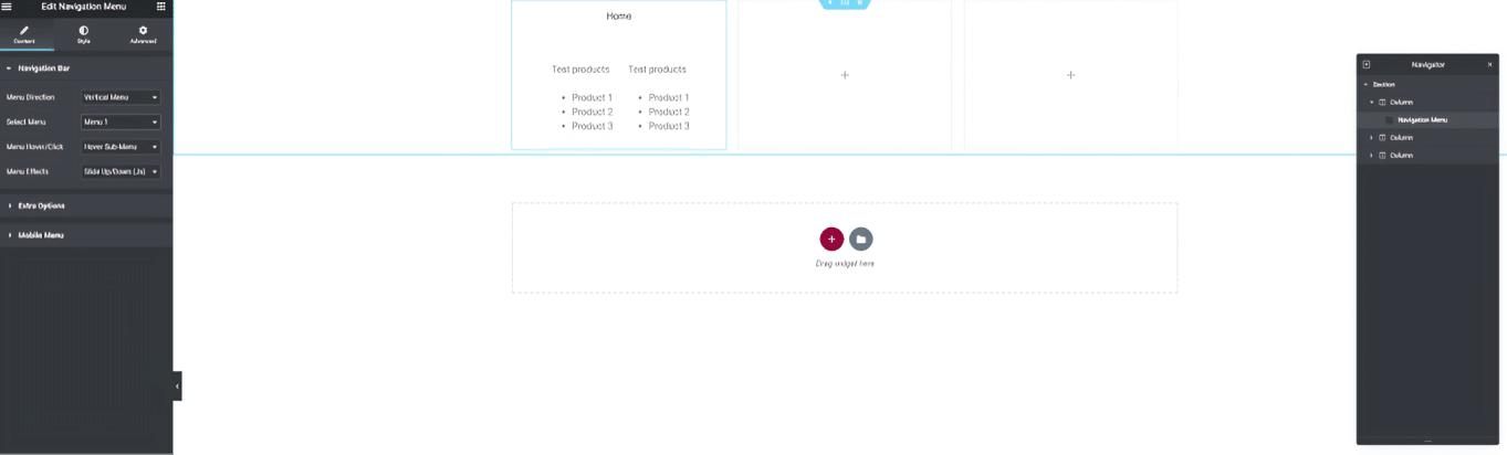
Because the base Nav Menu widget stops at a single-column dropdown, a true mega menu panel comes from one of two places: a mega-menu-specific widget inside a broader Elementor addon pack, or a standalone WordPress mega menu plugin that hooks into your existing menu location.
Either route gives you a container-style dropdown where you place columns, headings, icons, and images the same way you would build any other Elementor section, then assign that container as the submenu content for a specific top-level item. The exact assignment step (a dropdown setting, a shortcode, or a template picker) varies by which widget or plugin you choose, so check its own documentation for that one step.
Structuring the Columns, Images, and Links
Once you have a container to work in, treat it like any other Elementor section: nested containers or columns for each group, a heading widget at the top of each, and a list or set of text links underneath. Keep each column to one clear topic, since a mega menu that mixes unrelated links inside one column defeats the purpose of grouping.
Images work best as a single featured column rather than scattered throughout, both for load time and for visual clarity. If the mega menu includes a promotional image or a category thumbnail, size it once and reuse the same dimensions across every top-level item that has one, so the panel height stays consistent no matter which item a visitor opens.
Positioning a Full-Width Panel Correctly
A mega menu panel that inherits the width of its parent navigation item stays narrow and cramped, which defeats the point of a multi-column layout. Most mega menu widgets include a width setting; set it to full width or to a fixed pixel value wider than the trigger item, and confirm the panel is positioned relative to the header, not the individual link, so it centers correctly under a wide navigation bar.
Stacking order matters here too. A mega menu panel needs to render above the rest of the page content, which usually means a z-index setting inside the widget itself; if the panel appears but sits behind other page elements, that setting is the first thing to check.
Mobile Mega Menus: What Has to Change
A four or five column desktop panel does not fit a phone screen, and most mega menu tools switch to a collapsed accordion automatically on smaller breakpoints, with each column becoming an expandable section instead of a side-by-side grid. Test this behavior directly on a phone rather than trusting the desktop preview, since a panel that looks fine at tablet width can still overflow at true mobile width.
Confirm tap targets are large enough once the panel collapses to an accordion. Column headings that were decorative text on desktop often become the tap target that expands a section on mobile, and they need enough padding to be reliably tappable.
Making the Header the Mega Menu Lives In Sticky
Once the mega menu itself is built, whether the header around it should stay visible while scrolling is a separate decision. Elementor Pro includes a basic sticky toggle in its Theme Builder, and it works fine with a mega menu already in place, but it is on/off only, with no scroll-triggered background change, shrink, or hide behavior.
Sticky Header Effects for Elementor adds that sticky behavior plus 21 scroll effects on top of a header you already built, on Elementor Free or Pro, and it does not care whether the menu inside that header is a simple dropdown or a full mega menu. It does not build the mega menu itself; its job starts once the header, mega menu included, already exists. See the full effect grid for what changes on scroll once a header is sticky.
Honest Limits
Elementor’s own tools, Free or Pro, do not include a native multi-column mega menu widget as of this writing. If your build needs one, a dedicated widget or plugin is not optional, it is the only route, and that choice is worth making early rather than after the navigation structure is already built around a single-column assumption.
Sticky Header Effects for Elementor does not build mega menus, dropdown menus, or any menu structure at all. Its 10 free and 11 Pro effects control how an already-built header behaves on scroll, and none of them add navigation content. Current plan details for Sticky Header Effects for Elementor are on the pricing page, separate from any mega menu tool you choose.
Frequently Asked Questions
Can I build a mega menu with Elementor Free? Elementor Free does not include the Nav Menu widget or a dedicated mega menu widget, so a structured, multi-column mega menu needs either Elementor Pro plus a mega-menu widget, or a standalone WordPress mega menu plugin.
Does Elementor Pro include mega menus by default? No. Elementor Pro’s Nav Menu widget supports dropdown submenus but not a multi-column mega menu layout, per Elementor’s own widget documentation.
Will a sticky header plugin conflict with my mega menu? A sticky-header plugin like Sticky Header Effects for Elementor controls scroll behavior for the header as a whole, not the menu’s internal structure, so a properly built mega menu and a sticky header effect run independently of each other.
For the accessibility side of a mega menu, the W3C’s ARIA menubar pattern documents expected keyboard behavior for multi-level navigation, and Elementor’s own Nav Menu widget guide covers what the base widget supports before you add anything else on top of it.
Want the sticky header without the code?
Sticky Header Effects for Elementor drops in as a widget. Free plugin, no account needed.
