
How to Shrink a Header on Scroll in Elementor
A header sized for a hero section takes up more vertical space than a page actually needs once the visitor has scrolled past that hero. Shrinking it on scroll is one of the most requested sticky-header behaviors, and Header Shrinking is one of the 10 free effects in Sticky Header Effects for Elementor that does exactly this, no custom CSS required. This walks through setup and the specific values worth checking before calling it done.
A closely related effect is Logo Shrinking, usually set to a matching trigger point so both resize together.
Key Takeaways
- Header Shrinking is free, one of 10 effects included forever on unlimited sites, no Pro license needed.
- It reduces the header’s height and padding once the sticky state activates, controlled from the same Elementor Advanced tab panel as every other Sticky Header Effects toggle.
- The shrink transition timing is fixed rather than a field you set by hand, so most of the actual tuning happens on the before-and-after size values, not the animation speed.
- “elementor shrink header on scroll” gets 10 searches a month with a keyword difficulty of 43, DataForSEO, pulled 2026-09-15, a genuinely hard-to-rank term relative to its own modest volume.
- Pairing Header Shrinking with Logo Shrinking, a separate effect, is the most common combination, since a shrunk header with a full-size logo tends to look unfinished.
Before You Start
You need a header built as an Elementor section or container, with the base sticky control already enabled. Header Shrinking changes the size of that existing sticky header; it does not create the sticky behavior itself, so turn that on first if you have not already.
Install Sticky Header Effects for Elementor from the WordPress.org plugin directory if it is not active: Plugins, Add New, search, Install, Activate. No license key is required for the free tier, and the plugin requires WordPress 6.3 or newer and PHP 7.4 or newer.
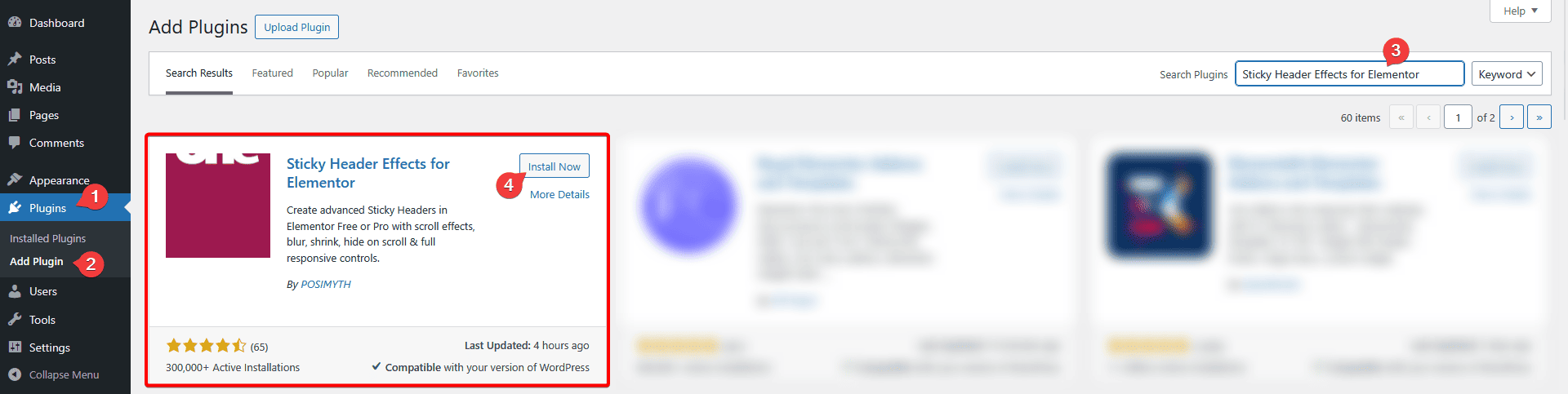
Step 1: Turn On the Header Shrinking Toggle
Select the section or container wrapping your header, open the Advanced tab, and expand the Sticky Header Effects panel. Header Shrinking sits alongside the other 9 free effects: Header Scroll Distance, Transparent Header Background, Dynamic Background Color Change, Bottom Border Styling, Logo Shrinking, Logo Color Change, Blur Background, Hide Header on Scroll Down, and Above Header Section.
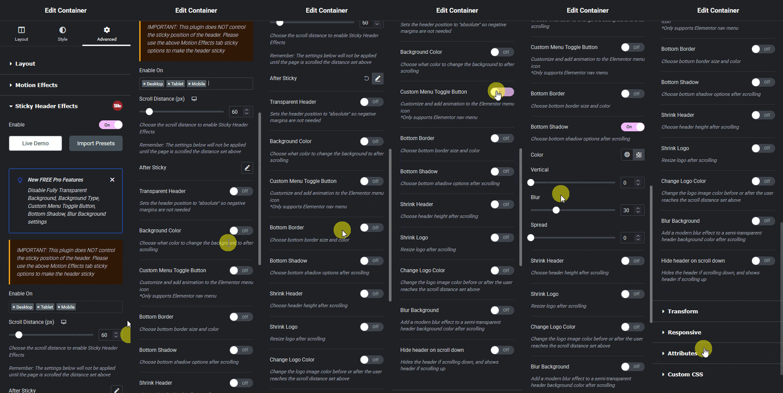
Step 2: Set the Shrunk-State Height and Padding
Header Shrinking exposes height and padding values for the sticky state, separate from your header’s normal, non-sticky size. Set these smaller than the default values; a common working ratio is shrinking the header to roughly 70 to 80 percent of its original height, since a more aggressive reduction than that risks clipping logo or menu text if their own size is not adjusted at the same time.
If your logo does not shrink along with the header, it can end up visually oversized relative to a now-shorter header bar. Logo Shrinking is a separate free effect built for exactly this pairing, and enabling both together, rather than Header Shrinking alone, is the setup that actually looks finished on most builds.
Step 3: Set the Scroll Distance That Triggers It
Header Scroll Distance, a separate effect, controls how far the visitor scrolls before Header Shrinking and any other sticky effect fires. Set this in pixels based on your actual hero height, not a guess, since a short hero and a tall hero need genuinely different values, and the same value copied across templates with different hero heights is the most common reason a shrink effect looks broken when it is actually just misconfigured for that page.
Step 4: Check Every Device Separately
Height and padding values for Header Shrinking can be set independently for desktop, tablet, and mobile, through Elementor’s standard responsive-mode icons. A shrink ratio that looks proportionate on a wide desktop header can crush a mobile header’s touch targets below a comfortable tap size if the same percentage is applied without checking the mobile breakpoint directly.
Test using Elementor’s responsive preview mode rather than only resizing a desktop browser window, since mobile browsers handle sticky positioning differently during address-bar show-and-hide behavior on scroll, which can affect how the shrink transition actually looks on a real phone.
Starting From a Template Instead of a Blank Header
Sticky Header Effects for Elementor ships 50+ ready-made header templates, several of them built specifically around Header Shrinking and paired with Logo Shrinking already configured together. Importing one of these is worth doing before building the shrink values from scratch, particularly if your target look is close to a template’s live demo, since the height, padding, and scroll-distance values arrive already tuned rather than guessed.
Each template opens a live demo before import, which is the right moment to check it at your actual target breakpoints, not just desktop. A template tuned for a wide desktop logo can still need its mobile shrink values adjusted for a narrower logo of your own.
What Actually Goes Wrong
The header shrinks, then immediately expands again, in a loop. This is almost always a Header Scroll Distance value set too close to a point where the page naturally scrolls back and forth slightly, such as right at a section boundary. Increase the distance value so the trigger point sits clearly past any natural scroll jitter.
Menu items overlap or wrap awkwardly once shrunk. This means the menu’s own font size or padding was not reduced along with the header height. Check the menu widget’s typography settings at the shrunk breakpoint specifically, since Header Shrinking resizes the header container, not the menu text inside it automatically.

What This Effect Does Not Do
Header Shrinking resizes height and padding. It does not change background color, blur the background, or move the logo on its own, those are the separate Dynamic Background Color Change, Blur Background, and Logo Shrinking effects. Combining several effects is normal and supported, but each one is configured independently, and turning one on does not automatically apply another.
Full setup detail specific to this effect, including field-level walkthroughs, is in the Header Shrinking documentation. For issues beyond what is covered here, the troubleshooting guide covers common problems across all 10 free effects.
Frequently Asked Questions
Is Header Shrinking free? Yes, it is one of the 10 effects included forever on unlimited sites, no Pro license required.
Does this work without Elementor Pro? Yes. Sticky Header Effects for Elementor, including Header Shrinking, runs on Elementor Free, which has no native sticky or shrink setting of its own.
Will shrinking the header hurt page performance? No. Every effect, Header Shrinking included, runs on CSS transform and opacity only, avoiding the layout-recalculation cost heavier scroll-JS implementations add, which keeps scrolling smooth even on phones.
MDN’s CSS position reference documents how sticky positioning works at the browser level, and the transition property reference covers the mechanics behind any smooth size change on scroll. See the full 21-effect grid for how Header Shrinking fits with the other 20 effects, and the complete sticky header setup guide for the base sticky configuration this effect depends on.
Want the sticky header without the code?
Sticky Header Effects for Elementor drops in as a widget. Free plugin, no account needed.
